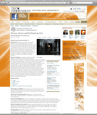
For The London School of Film, Media and Performance we produced a 'Roadblock' on the Independent website, simple striking visuals, combined with simple messages allowed for a creative solution building brand awareness for this new higher education establishment.
The Creative and the (Insert Suggestion)
The Creative and the ( ) is a blank space for me to put up new work, old work, freelance work and simply share it with the world
Blog Posts
1.6.10
21.5.10
Good End to the Week
Why I Design
Being in the UK I often don't get to see the workI produce in action but some simple banner stands that have gone up at one of the major hotels in Siem Reap brings with it a deep sense of pride. providing AHC with the basic principles of marketing and advertising means that much of their new material has harder hitting emotive messages and the development of 'The Big Green Heart' concept is one that we can all be very proud of as it will stand the test of time
13.4.10
Love Finding Stuff!
THE THINGS WE LOVE
Several years ago I had the good fortune to be in Switzerland (lovely country, shame about the prices). I had been playing football at some local event in the all Anglo-Swiss-Irish team and despite not having won we found good reason to celebrate in the local (and only) Irish bar in the town. As I sat with my delightful pint of Guiness (yes in those days I drank) I came across a weathered and beautiful poster of Lawrence of Arabia and knew that I had to have a picture!
So in line with my promise to myself that this blog would be a space for work I have produced it is also going to be a place that I put up things that I came across that I enjoyed
7.4.10
Is that Bugs Bunny?
CAMPAIGNS! CAMPAIGNS! CAMPAIGNS!
The establishment of an advertising style for TFC was a difficult choice ... how do you create a difference in a numbers orientated market, we decided that soft learning was the best way. Simple adverts, colourful and eye-catching that had strong messages were central to increased recognition of brand and traffic through the sales department of TFC.
Love My Partnership
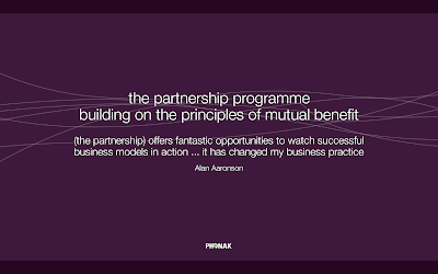
THE PARTNERSHIP PROGRAMME
As part of the first anniversary of The Partnership Programme Phonak decided to produce a multimedia presentation to support a series of trade events. The presentation was a flash animation production and ran for around 3 minutes. The presentation needed to be slick, on brand and most of all punchy as it pushed a premium service to resellers. The production was supported by numerous printed materials and sales staff.
SCREENSHOTS
3014. The Land That Finance Forgot
BEFORE THE CRUNCH
3014 Mortgage Complete was the brain child of a financial expert as part of expanding portfolio of companies. In 2004 I was one of a group of freelancers and design agencies invited to a creative pitch for a project titled 'Poacher' (3014). The concept was a mortgage that could be decided upon in just thirty minutes and delivered complete in fourteen days. This was the first pitch I had ever prepared from start to finish on my own and was due just three days after the initial meeting. A tough 36 hours followed as I produced research documents, pricing documents and various other elements that would enable me to develop a name, logo, outline for corporate stationary and website visuals.
The name that was developed was 3014 Mortgage Complete and I built a flexible branding solution that would grow with the business and have the ability to move with the needs of the business. Below are a few examples of the material that went into the pitch document. Sadly this was a pitch I didn't win, though perhaps I was relieved and I enjoyed the creative process of my first solo pitch.
The pitch document is available via email for those interested please email me
LOGO
30.3.10
The No.1 Animal Place Beat Their Own Drum
BEATING ON THE DRUM
The No.1 Animal Place as well as being the only pet shop and veterinary clinic for more than 400 kilometres it was also a source of unique material such as T-Shirts for the tourist market.
In order to attract people through the door The No.1 Animal Place created a sense of community with its customers and traveling band of fans. By producing regular newsletters, Facebook updates and online videos this community was able to be kept together and people who had passed briefly as they waited to see the vet could keep up to date with what was going on.
The newsletter itself was a mix of product news, local events (the story on the cover of issue one was about serious local flooding) and reviews. The publication is released as an email download and a printed publication as well as a large format version that resides in the main store were customers/clients are often amused to see themselves or their animals as a centre of attention.
Showmanship
COLOUR RULES
Cosatto are one of the largest developers and producers of baby products and to highlight their new lines each year they take part in the Harrogate Expo. These panels were designed to showcase a fresh and dynamic design ethic in addition to showcasing their strong association with Disney. Each completed panel section was over 4 metres in length and gave a truly visual experience that promoted a new brand image and revitalised retail presence.
Building Websites! HOHOHO
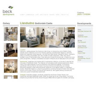
BECK DEVELOPMENTS
The Beck website was a simple project intended to help sell homes in the Manchester/Lancashire area. With a clearly defined brand the site was developed as an extension of this.
The trick was to produce a website simple enough that the client could assume control once it was completed but without incurring the cost of a CMS. Therefore a simple set of templates was developed and a simple series of graphics. A non-editable flash movie was produced to add variety. In addition to the creation of the website I oversaw the photo shoot so that we were able to get the best most consistent pictures to create an allure and desire for some of the most beautiful Manchester buildings.
Online or Offline?
DANIEL AVERY PHOTOGRAPHY
There was a time that I used to build websites (now I just design them). This website (split iflash and HTML versions) was a gallery and information site to help promote Daniel Avery as he aimed to become a respected photographer. The site was supported by direct mail, literature and other marketing essentials and was my first attempt dipping my feet into the world of freelancing.
Noise 4
ATTIK
There are a number of design things I love, Baseline, Design Week (before the redesign), Harper Collins logo, Milton Glazer, etc, etc. Never to make that list was The Attik, they do great work, always have done, very much them when they want it to be but very much on brief when they need it to be.
When I was a student they had a brief out for Noise 4, the book to end all design books perhaps? Anyway the brief came through the Society of Typographic Designers who are on my list of things I adore and so I set about creating a solution that adhered to my own sense of design ethic, was very much the Attik and also had simply simple but unmistakably good typography. Looking back I probably achieved none of this but I had fun doing it.
FAVOURITE MEMORY
I suppose this project was most famous for having a double page spread of my own genitals housed in a sheep shaped pouch, thankfully this image no longer exists.
TFC? The Funky Chunky? Two Fat Cats?
PROFESSIONAL SERVICES
The Finance Centre (TFC) was my first in house role outside of London and offered me the opportunity to learn some new marketing skills from guru Simon Wade. My role was the creative aspect to his marketing strategy but as time wore on we developed the strategic elements together focusing on ensuring that we stayed ahead of the competition with clear messages and well defined advertising campaigns. This was all done inside brand guidance (that was developed by myself and the team) and the strictly regulated FSA guidelines.
MORTGAGE APPLICATION FORM
'STYLE & CONTENT' DIRECT MAIL
Art & Cats
MIAOW
Being asked to produce artwork is a little different to producing an AR or DM. A former colleague asked if I would produce a graphical portrait of their cats. I set about the task by trying to best understand the sibling cats. From an early point it was clear they loved one another and were often found together but as house cats had too much energy. I created graphical representations of their heads and then using colour and movement produced the energy that they showcased as I watched them. The result was a simple piece over 1.5m in length that became centrepiece to the clients office.
29.3.10
Tennis
NIGEL V PAUL
My first ever Head of Creative and I have over the years played many games of Photoshop Tennis, this was an example of the stupid stuff we used to put together as we looked for inspiration. (Edited to protect names and emails addresses). Tennis I find offers designers an opportunity to express themselves for 20minutes away from their daily work and yet still be creative and come back to their real project a little more refreshed.
VISUALS
First Timers
TAKING THE CHERRY
First time annual reports are a complex project as an organisation goes from being private to listed. Cineworld needed a simple and yet transparent AR that communicated the depth of its scope but with an understanding of need for the coming financial hardships. Therefore a simple and yet sophisticated approach was needed. Using a deep knowledge of paper stock and printing techniques we used Stephen and transparent tip ins to create something understated but still special. The result was an 'on brand' sophisticated Annual Report
VISUALS
Developing Strategies That Work
CREATING DISPLAYS
Part of the fund raising strategy for the hospital has been the creation of spaces within 5 Star hotels and resorts in Cambodia. The idea is to help create allure and sympathy that will bring people to the hospital and support the amazing work they do either through donations of money or donations of time. These are examples of two of the spaces currently in operation.
ANGKOR PALACE RESORT AND SPA
26.3.10
The Siem Reap Experience
LOVELY NEW ADVERTS
Appearing at the Siem Reap Airport in Cambodia I have new adverts going up! Keeping the brand intact we have begun the roll out of the 'Big Green Heart' which is the nickname for Angkor Hospital for Children. Set in three languages this advert is intended for new tourists to collect their bags and make a mental note to visit one of the great wonders of any Cambodia visit. Next up is the website!
24.3.10
When I Write My Book
CAMBODIA GAVE ME AN IDEA
I'd love to write a book based on my experience in Cambodia but I don't think it would be a silly traditional book ... oh no, it would have chapters but each chapter would be about a person, someone that affected my life for either the positive or negative. It might be a visual piece I'm really not sure, I'm very much at the thinking stage ... perhaps the best stage.
Anyway this visual is the first part of my story telling about the past year - expect more ideas that I will commit to digital paper over the next few months! Adios true believers
Chasing Chi-X
WHAT LIES BENEATH
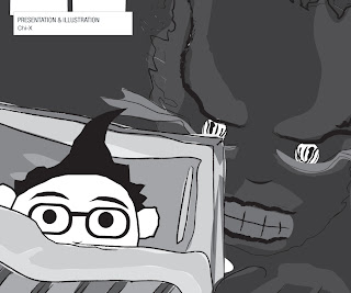
I can't explain what Chi-X do so best let them 'Chi-X Europe allows participants to trade equities across major European markets at significantly lower costs and faster speeds than many of the primary exchanges'. When they were having their first major marketing push in the UK they requested a short PPT presentation that was highly visual and highly illustrative that the CEO could use as a background to his key messages.
What was designed were 20 illustrations that ran in a PPT presentation to supplement his story. Each illustration used a soft learning approach so that the message was caught from the CEO and only supplemented by the creative. These images were all in black and white to allow the dynamic red colouring in the logo to stand out.
Chi-X described the presentation as a success and the characters created both original and appropriate as they looked to make easy learning of a complex subject.
I Just Signed Up For
FILM!!!
I love being back in England, the rain and the sleet are some of my favourite things, add to this the cinema and well you almost can't go wrong. The problem is the cost of cinema is terrible - £10 to see Alice in Wonderland on a Monday night. So in light of this (and the fact I don't view rain and sleet as good alternative and free entertainment) I have just ordered my Cineworld Unlimited Card, I had one a few years back and I used it alot! Anyway enough of my dribblings, the reason I mention this is because the photograph I took was so bad that I just wanted to share it with you all - bloody Mac webcams! Enjoy true believers
A Generous Old Soul
BECAUSE
Even though we all have super fast, super silly internet connections sometimes it can be hard to have your inbox filled with oodles and oodles of stuff. So here is a link to a download for my 2010 CV. Grab it now while it's still hot! http://www.mediafire.com/?noo4nmmzymk
If the link is not firing on all cylinders (these things happen) then simply copy and paste it into your browser
At worst send me an email and I'll fire you a copy across
The Power Of Tennis
I LOVE PHOTOSHOP TENNIS
Sometimes you really do have to let your hair down and this day was no exception. Many thanks to The(S)Hocker who was my partner in crime on this particular game of Tennis! Games like this help develop creativity and the topics can be as naughty or nice as you like. This particular game was showcasing deep frustration. Request the whole game by emailing me at paulkdesigner@googlemail.com
Round 9
Round 7
Round 1
23.3.10
Phew!
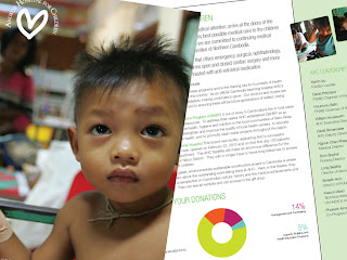
THE BROCHURE
Being a designer is can be a frustrating nightmare but thankfully most of the time the clients give you the kind of faith deserved. I'm really lucky with AHC, they let me do what I want because at the end of the day I'm supporting the bottom line and helping to improve the level of donations to this amazing organisation. The brochure came to me about 4 weeks ago as a trifold DL, already designed by the American agency that has served as the creative guardians of the charity behind AHC. As part of the structural review that we performed it had been decided that creative would come from the marketing team at the hospital instead of the charity. With a time pressure the artwork that the agency had been working on was sent over and from the bottom up it was dire. The content was weak, messages mixed and the visuals a were a poor collection of misplaced sentiments.
WHAT TO DO?
I started with a brief review, advised that the content needed completely rewriting, made sharper, shorter, punchier and generally more concise and positive. The format was reset to become trifold A5, more visuals were used to help promote the work done by the hospital. Figures were replaced by easy to use pie charts and an emotive hero shot was used across the front and back covers. Essentially it was all made much simpler and with a greater focus on 'the core need and core success'.
TODAY?
The brochure has just gone to print in Cambodia today (a potential disaster in the making) but this is one of the first times that AHC has pulled together for the purposes of marketing, drawing on all levels of support to get the marketing job done with great care and attention. As a designer I am proud of the way the team worked here and the brochure, while nothing ground-breaking, is both on (new) brand and a marked improvement on previous efforts.
This might make my 2011 portfolio, who knows! Good work!
22.3.10
Movie Making
THE POWER OF ILLUSION
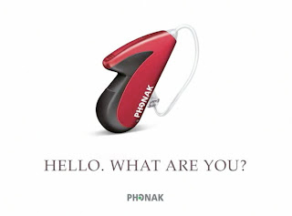
As part of the UK launch for the latest Phonak hearing system it was decided that a short promotional video would be shot. The emphasis needed to be on the discreet nature of the product and the fact it looked more like a fashion device than a hearing aid.
This was part of a reputation enhancing exercise as much as it was a sales tool. The five minute film introduced the device and then create links between it and other major aspirational brands such as Apple and Nike. By developing a culture of 'cool' it was hoped to defeat some of the stereotypes associated with the deaf community and also draw in the hard of hearing community that would often cope with hearing loss simply to avoid the associations with being deaf.
The film took to the streets to question a wide variety of people on what they thought the device might be. Popular answers included MP3 player and Bluetooth device, very few people associated it with a hearing system.
The film was played at trade shows across the country to support the marketing push of the device.
21.3.10
The Art of the Magazine
ADVENT INTERNATIONAL HIT THE SHELVES
Advent International are one of the leading Private Equity firms. In order to support their market leading position they produced regular 'thought leadership' publications. The publication was a mix of corporate brochure and magazine and with well defined graphic guidelines the publication had numerous constraints. However, the publication would be a break from its own weighty tradition as we increased the pages and lightening the pages by replacing the darker black pages with white pages and by reducing the amount of gold in the document so it became more of a highlight than a dominant.
The publication looked at the whole of Eastern Europe with specific articles about certain businesses or locations. Each section required a separate look and feel but because of its corporate document overtones, also needed to remain cohesive. The revised publication style was released in 2008 and has served as its style since.
20.3.10
Ask Earl ... I Mean URL
URLs
Jay Pritzker Academy / www.jpa.org.kh / Ethemba Capital / www.ethembacapital.com / Augentius / www.augentius.com / Angkor Trade Center / www.angkorshopping.com.The nature of the internet is that things move on and evolve, the beauty of it I suppose, if you would like to see further examples of online based work please contact me at my email address
When the Brand is Amazing it Works!
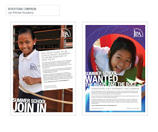
THE JPA
The Jay Pritzker Academy are one of the foremost schools in Cambodia. As a school dedicated to the education of Cambodia's poorest children they have a challenging and rewarding task.
Key to their ongoing success is the raising of funds to put the children through American universities and ensuring they continue to attract the best possible teachers.
Marketing was needed to help sustain growth and to promote some of the work that goes on at JPA. Using the already established logo a brand was evolved around this. A tone of voice was created and collateral (including brochures, folders, website, postcards, etc) was built up and a regular high quality newsletter is now produced.
The JPA now feel they are fully equipped to go forward and develop both funds and their name therefore ensuring the bright futures of hundreds of young Cambodian children
We Really Want You to Dial 999!!!
THE PROBLEM OF AN OVERDOSE
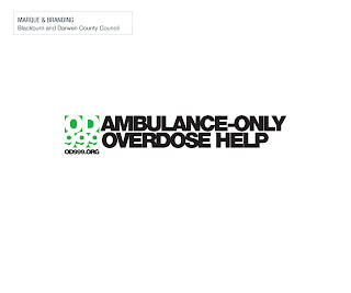
Blackburn and Darwen Council instigated an initiative that was designed to help the most serious of drug users who overdose. During the campaign people who called an ambulance for a person who had overdosed would have no questions asked, nor would arrests be made. This had been identified as the key concern for those who had witnessed an overdose.
Communication for this needed something a little more elaborate than a brochure in the doctors surgery. With this in mind a series of measures were implemented beginning with a new logo, posters and microsite. The key to the campaign was the clean graffiti. Large stencils were produced of the logo and jet washed onto dirty buildings and in locations that drug users were known to frequent. Added to this low tack stickers were employed in telephone boxes and in train stations to help improve awareness.
The campaign was judged to be a success based solely on lives saved from those who called the ambulance in this particular instance.
Redleaf Relations
THE RED ROBOT
After being a designer for nearly ten years I have long dreamed of finding a project were my love of classic robots could be combined with my love of design (perferably corporate because this is were you are least likely to find robots!). The project I was looking for arrived in the form of Redleaf Relations Financial Investment Support document. The project had been in production for over a year prior to my own arrival at Bladonmore because the creative direction of the project had become stagnant and found wanting.
However new blood on both sides decided that this worthwhile project needed something else. The guidance was simple, 'it should be copy led and it should be red' the rest was down to me.
Three concepts were created, one traditional, one they would go with and the robots. To even my own suprise the robots were selected as both the driving idea of the brochure but also as a key instrument in this campaign. This brochure was short and direct but proved that a corporate brochure could be highly creative
9.3.10
The No.1 Animal Place
T-SHIRT FUN
There are times when being a designer is a lot of fun. I never thought I would say that about Cambodia but when developing a series of T-Shirts to expand the business offer of 'The No.1 Animal Place' I got just what I needed.
The T-Shirts themselves were an attempt to move the business into the lucrative tourist market and to help shake up the creativity in tourist tat available in places like Siem Reap.
Owner Hannah Padley said 'Having one of only two pet shops and surgeries in the whole country it felt like a responsibility to ensure that we met all the needs of our customers and more importantly potential customers. With this series of T-Shirts we could be cheeky and therefore achieve a new level of awareness with crisp and fun creative'
The T-Shirts went from 'kinda cute' to ' Cambodian Corruption' right through to plain outright insulting (the picture of a dog suggesting he loved Korean food was a firm local favourite). The T-Shirts were also an opportunity to expand the brand beyond the confines of the normal printed material and the fun aspect was something that the business was all about - even given the life and death nature of what the veterinary surgery does.
Subscribe to:
Posts (Atom)