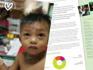
 THE BROCHURE
Being a designer is can be a frustrating nightmare but thankfully most of the time the clients give you the kind of faith deserved. I'm really lucky with AHC, they let me do what I want because at the end of the day I'm supporting the bottom line and helping to improve the level of donations to this amazing organisation. The brochure came to me about 4 weeks ago as a trifold DL, already designed by the American agency that has served as the creative guardians of the charity behind AHC. As part of the structural review that we performed it had been decided that creative would come from the marketing team at the hospital instead of the charity. With a time pressure the artwork that the agency had been working on was sent over and from the bottom up it was dire. The content was weak, messages mixed and the visuals a were a poor collection of misplaced sentiments.
WHAT TO DO?
I started with a brief review, advised that the content needed completely rewriting, made sharper, shorter, punchier and generally more concise and positive. The format was reset to become trifold A5, more visuals were used to help promote the work done by the hospital. Figures were replaced by easy to use pie charts and an emotive hero shot was used across the front and back covers. Essentially it was all made much simpler and with a greater focus on 'the core need and core success'.
TODAY?
The brochure has just gone to print in Cambodia today (a potential disaster in the making) but this is one of the first times that AHC has pulled together for the purposes of marketing, drawing on all levels of support to get the marketing job done with great care and attention. As a designer I am proud of the way the team worked here and the brochure, while nothing ground-breaking, is both on (new) brand and a marked improvement on previous efforts.
This might make my 2011 portfolio, who knows! Good work!
